Mypiece case study
Contracted project
Timeline
March 2016 - March 2017
Responsibilities
Wireframing / Prototyping / Product design / Mockups
Team
Zach Ahmed / Ryan Angelo

Project done for the Mypiece team to improve the user experience of the app and to design features to start generating income.
The mypiece app is a deal-finding app aimed at students and professionals to help them get deals on food. The from the app, the users could find exclusive deals from local restaurants and redeem them through the app when at the cash, like a coupon. The app was popular among students, because of cheap food, but it had low ratings on the Google Play Store and App Store.
The Challenge
Because of the bad reviews, we had to improve user engagement by the revamping the experience. The parts of the app that I wanted to focus on were the redeption process, and the main page layout. The project owners also wanted me to help design a feature that would start generating revenue for them.
Constraints
Because the company was so small, I had to work around a lot of contraints. The biggest ones were man-power and budget.
The product team consisted of me and the product owner, who isn't a designer, so while it was all collaborative the process was slow.
Because of the constrained budget, we had limited access to users to interview for testing and research purposes, but we managed to get a couple people in by offering them free food vouchers. The project managers also decided to outsource most of the programming because of the lower cost. In the end it was detrimental to the quality of the app with a lot of android users complaining about the app not working on their devices.
The Approach
The way we were going to work was that I was going to propose changes to existing pages, and then get approval for them from the project manager and then iterate designs on them. For new pages, I would collaborate with the PM to figure out what tasks the user would need to perform on that page and then list the requirements for it. From there I made a list of requirements, and started iterating on wireframes and mockups.
Process
I started on this project by looking at the app as it was and Identifying areas where it obviously needed improvement. I saw two key areas that needed to be redone. The first was the home page. The layout was a simple one-column with full-width sections for each of the deals, but it looked cluttered which made it harder to tell what the deal was. My proposed solution was to divide each deal into its own card with more space on the top and bottom, and also to highlight the deal price by making the text bigger and a positive colour while showing the original price crossed out underneath.
The other thing that I wanted to focus on was the redemption process. Originally, the user would pick a deal that they wanted to redeem and proceed to the restaurant. Once at the restaurant, they would order what the deal included and then head to the cash. At the cash they would then open the deal page and hand the phone over to the cashier, who would press redeem for the customer. Although the process was simple enough, I found it to be invasive. To confirm my feelings, I asked 10 friends if they would be comfortable handing their phone over to a stranger. 8 of them said that they were not comfortable doing so, and the other two said that they didn’t really care. Some concerns that my friends brought up were: What if their hands are dirty? What if they drop it? What if they do something they’re not supposed to? This confirmed that the app needed a better system for users to redeem their deals.
I then brought my proposed changes to the project manager who gave me feedback on the changes and proposed some of their own. We started going through all the other pages of the app discussing the user-journey and how it could be improved. We also started talking about the new features we were going to design.
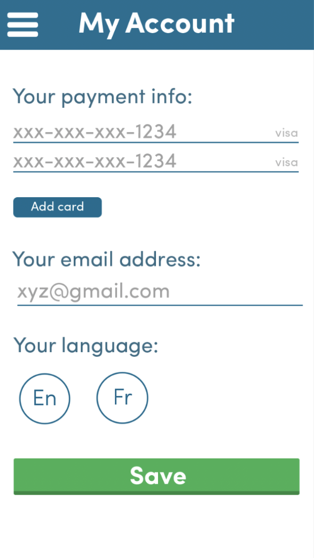
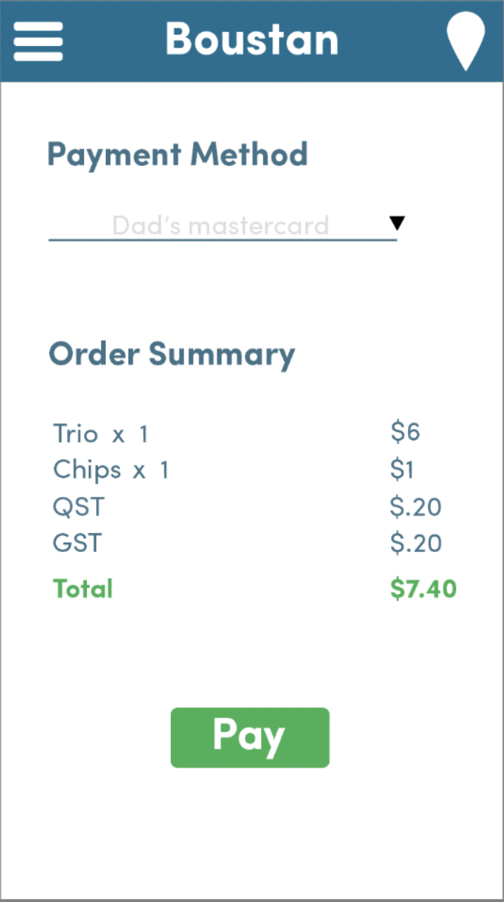
The flow of purchasing and redeeming a deal was the most significant change made to the app. As opposed to selecting a deal that a user wanted, and then handing their phone over to the cashier to be redeemed, users were now able to pay for their food through the app and head to the restaurant to pick it up. The cashier would only have to validate that the deal had been redeemed, so that it could not be used a second time.
The new purchasing flow would show the user all the important information that they would need to know like: exactly what the deal consisted of and the price, how much time they would have to redeem the deal, and a map of where the restaurant was located. Once the user decides that they want the deal, they would be directed to the order screen where they would choose how many of the item they want and if they would like to add any add-ons to their meal. The add ons were an important element in getting support from the restaurants, as they provided a way for them to sell smaller items without losing any margin.

Outcome
We successfully managed to make a better in-app experience, while also managing to generate income through the redemption of deals. From app reviews, we found that some users appreciated the change to require a credit card, while some others didn’t. We also found that although people seemed to be enjoying the overall experience more, the app didn't work well because of outsourced development.
This project helped spark my passion for UX and UI design and forced me to learn a lot about designing for users while keeping business needs in mind. If I were to do it again, I would stress the importance of QA testing and the advantages of being able to design based off of qualitative data obtained through user research and testing.